LOCAL! Amaize! Sweet Corn - The Best Corn You'll Ever Eat!
Homegrown Amaize! Sweet Corn
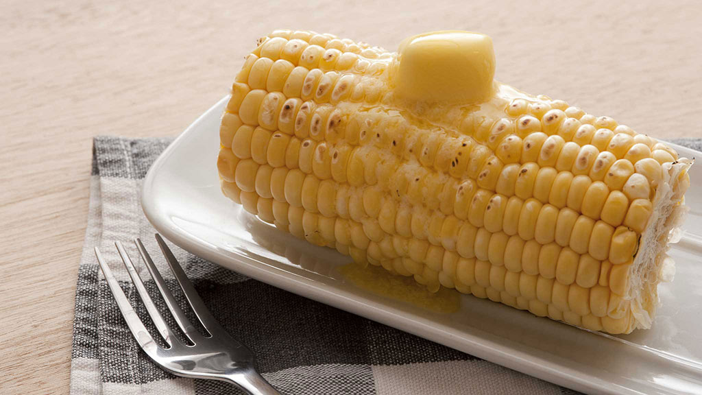
White Sweet Corn with an Amazing Flavor, Distinctively Delicious Pop and Crunch
12 for
$
4
99
lb.

Available for a Limited Time
Starts 4/10/2050
Recipe: Amaize Sweet Corn Summer Spreads